That’s Just Gross
Submitted by Atlas Indicators Investment Advisors on June 28th, 2023
It kind of makes sense that income and spending are linked. Think of your own household. There’s monthly income that comes in (payment for your production), a portion of that is spent, and what is left over is saved. And what becomes of that savings? Well, your bank may lend it to others and who then spend it in the economy. In a stylized aggregate way, America’s Gross Domestic Income (GDI) should equal our Gross Domestic Product (GDP).
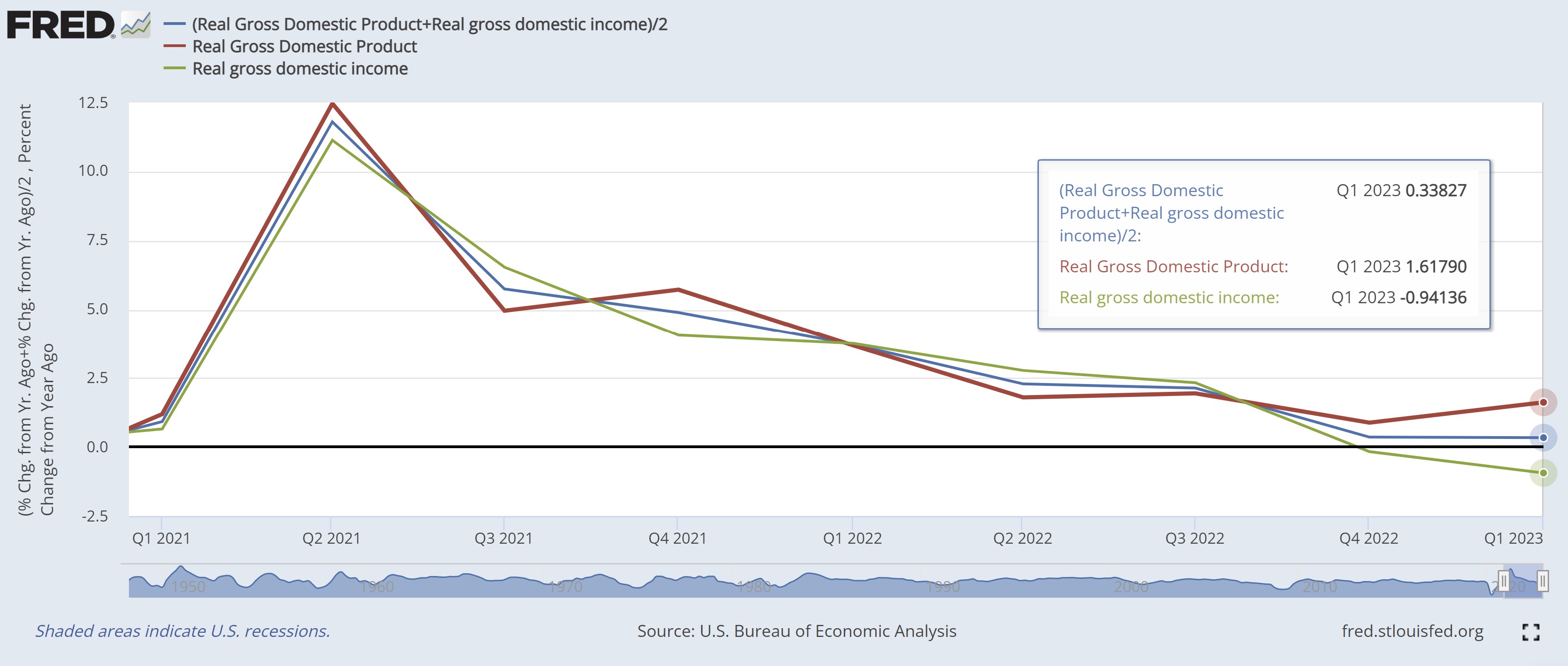
Life is too messy to fit simple stylized models though. Quantifying whether this relationship is steady is tough. This difficulty arises in part because the economy is so large, sampling is used which introduces statistical discrepancies. As you can see in the chart above, the red line (GDP) and green line (GDI) move together but not in perfect lockstep.
One way to help reconcile the difference is by creating something called Gross Domestic Output (GDO). This is just a simple average between the two, done to help reduce the errors or biases (aka noise) inherent in the two statistics. As you can see above in the middle (blue) line, it is approaching the zero mark (tugged lower by GDI) on a year-over-year basis, even as GDP appears to be accelerating. Perhaps, our economy is weaker than traditional measures suggest, given that trend.
No matter how you slice it, the pace of growth in America is gross. It’s moving from the top left of the chart toward the bottom right. Now, that isn’t to say a recession can’t be avoided, but the probability seems to be rising. This is confirmed by forward-looking indicators like the Conference Board’s Leading Economic Index which remains at levels consistent with recession. Later this morning we’ll get another look at employment, a key driver to the income story. Any deterioration in that statistic could pull the income trend further into the negative, so stay tuned.

