![]()
Math Magic
Submitted by Atlas Indicators Investment Advisors on February 8th, 2018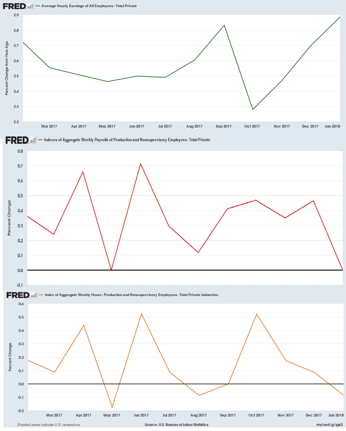
Atlas' Monday note covered the most recent employment report. If you did not have a chance to see it or want to reference it, click here. One of the more positive developments to come out of the report was an increase in average hourly earnings. This is an important statistic because it suggests employers are starting to pay workers more money, something thought to point to a tight labor market.
America’s central bank (the Federal Reserve) was assigned a goal in 1977 when Congress charged it to “promote effectively the goals of maximum employment, stable prices, and moderate long-term interest rates.” This has devolved to what is now called colloquially as the dual mandate; the Fed now tries to achieve stable price growth alongside full employment. The former is defined explicitly as 2.0 percent annual growth. Taking the most recent employment data, our current unemployment rate (now 4.1 percent, the lowest since January 2001) is a tad below their 4.6 percent median target.
When unemployment falls below the Fed's target, economists say it is a tight labor market. Such a condition is often accompanied by accelerating wages as employers compete for a limited supply of labor. Year-over-year U.S. wage growth (as measured by average hourly earnings) hit 2.9 percent in January, 2018, which, in theory, could cause inflation to rise if Americans actually spend this additional money at a faster pace, compelling our central bank to continue raising interest rates.. But Atlas thinks something else could be driving the wage gain data: math.
While on the surface wage data suggest the central bank is nearing their target, a deeper look into the cause of the uptick reveals a less optimistic narrative. Average hourly earnings are calculated by dividing aggregate pay by the aggregate number of hours worked. Unfortunately, total pay (the numerator) stagnated in December while hours worked (the denominator) fell, causing the ratio (wage growth) to rise to 2.9 percent compared to a year earlier.
Perhaps a quick illustration will help. In the graphs above, the green line shows the year-over-year growth rate of average wages. Immediately below it (in red) is the year-over-year rate of change for the amount of money firms are paying in wages each month. Finally, the year-over-year aggregate hours worked is in orange. As you can see from the bottom two, weekly hours worked fell in the last period versus a year earlier while payrolls were unchanged. This caused the ratio of average pay-per-hour to rise, but it doesn't take into account the additional workers added over the past year. Despite hiring these additional workers, employers saw no increase in the amount they pay their labor. This means the established employees are actually earning less as they see their hours on the job decline.
This is not an exhaustive look at the labor market, but it demonstrates one way in which math produces positive headlines even when the economy does not. Fortunately, employment data are frequently reported, so Atlas can monitor them to see if something materially negative is starting to develop. Sleight of hand is a wonderful parlor trick, but it is less entertaining within official statistics, or your paycheck. (by Christopher and J R)